Touching Up Apple’s iOS 7 Icon Set
Well, the Apple world has been living with the iOS 7 update for about 5 months now and the world hasn’t come to an end (yet). Those who know me recall that I loathed iOS 7’s new flatter look when it was first unveiled. In the months since that time, I have developed more of a love-hate relationship with the new OS. I love most of the new features Apple introduced, and there are aspects of the new visual style that are quite pretty (the frosted glass of Control Center for example). But, I still feel that, overall, Apple went and beat their flagship OS with an ugly stick. Nowhere is that feeling more pronounced than in Apple’s new default icon set. Even eight months after they were first unveiled at WWDC, I still hate them completely.
In the interest of full disclosure, I loved the original icon set that debuted with the first iPhone. I loved the glassy look, the intricate level of detail in icons like Safari, and the realistic textures in the Notes and Settings icons. While these touches certainly were not necessary for people to use the phone, they made the phone feel premium. It was clear someone at Apple took the time to craft something beautiful for each icon, and I think most people appreciated that.
So, what’s wrong with the iOS 7 icons?
With iOS 7, glossy, textured, and detailed is out. Instead, we now get icons that are flat, gaudy, cartoony, and hideous. Of course that last point is subjective. But I am not just saying they are hideous because they are flat. I have seen many concepts of flatter, less glossy icons, that look great.
Here are the issues I see:
- They’re inconsistent. Some icons are arbitrarily white, some black. Some have gradients that go light to dark, some have gradients that go dark to light, and some have no gradient at all. And, for some reason, Apple has stomped out all traces of gloss in iOS but left one icon with glossy bubbles (and why do we associate glossy bubbles with Game Center anyway?). It’s almost as if each icon was designed by a different group of people. All were following the same set of guidelines but ended up with slightly different interpretations.
- They’re lazy. Flat design should not mean easy design. In many ways, it should be harder because you cannot hide behind glossy effects and textures. But, these icons just don’t look like anyone put effort into them. The ones with white backgrounds look unfinished. The flat orange color in the calculator icon just looks like someone hit the paint bucket tool in Photoshop one too many times. The Phone and Messages icons have such poor contrast, it seems like no one ever bothered to look at the finished product. In many ways, these icons seem like a first draft or an afterthought.
Guiding Principles
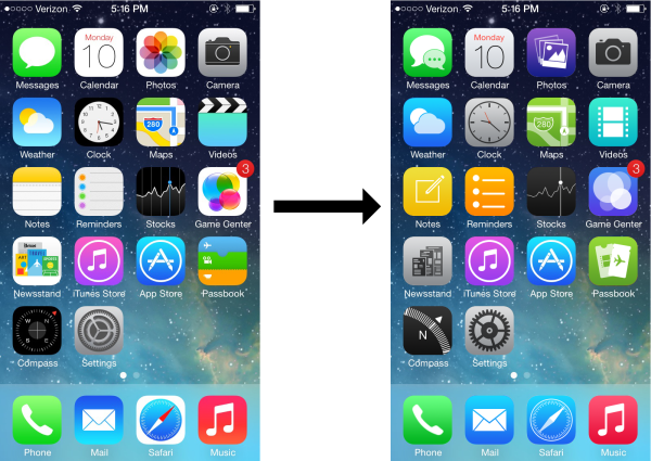
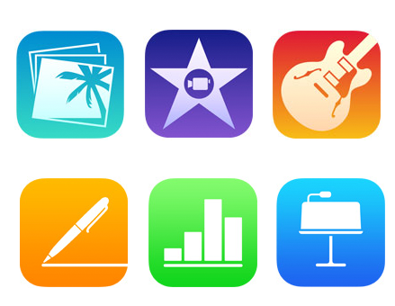
Luckily, with the release of a jailbreak for iOS 7, it is now possible to change the icons (YAY!). While there have been numerous themes put out recently to fix Apple’s icon disaster, none of them really did it for me. After thinking about it for a bit, I realized the reason was I didn’t actually think Apple had a totally bad idea for the icons in iOS 7. Rather, I felt they simply executed them poorly, possibly because iOS 7 had to be rushed just to make its release date. This theory is supported by Apple’s new icons for their updated iLife and iWork apps. These were released over a month after iOS 7 and all feature white glyphs on a colored gradient background. While each icon is different, they all look like they belong together; like they were designed by the same person. And, while the colors are bright, they are not as in-your-face as the colors in the default iOS 7 apps. Eventually, I decided to remake all the iOS 7 app icons in this style.
Before showing my new icons, I thought I should list the guiding principles behind their design. After all, the biggest strike against the current icons is that they aren’t coherent. I don’t want to repeat that mistake. Here are the central pillars of my redesign:
- All icon backgrounds will have a gradient that goes from light at the top to dark at the bottom. There will be no icons with a solid color/white/black background, nor will there be any icons with a reverse gradient.
- Each icon will have white glyphs to represent its app. The one exception to this guideline is icons with a grey background, where the glyph will be a dark grey to ensure there is sufficient contrast.
- If an app’s glyph needs to have any sort of layering to make sense, this will be done using transparencies.
- Apple’s icon grid lines will be used as a guide, but will not be treated as gospel.

Apple’s iOS 7 icon grid. Some of their icons follow it, some sort of follow it, and some don’t follow it at all.
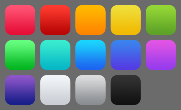
I also tried to use a consistent palette of colors. In general, these were picked to match the palette Apple used in iOS 7. However, I did tone down some of the bright neon hues in a few places.
Ok, now onto the icons! I decided to start with the ones that needed the most work and go from there.
The Icons
Safari
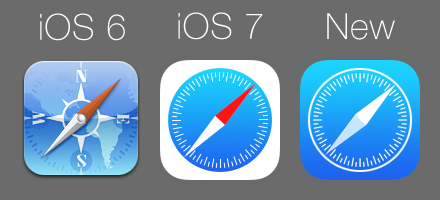
I think the Safari icon has been the most consistently disliked of the new set. Even people who like the new iOS 7 icons seem to agree that the Safari icon is ugly. I think the main problem is the random white space that borders the outside of the icon. It makes the icon look unfinished, almost as if the designer was throwing the icon together the night before the WWDC keynote and only was able to render the compass part before running out of time. Personally, this icon, and a few others in iOS 7, makes me wonder if Apple had originally planned to use round icons in iOS 7 before deciding to stick with rounded rectangles of previous versions. This icon just wants to be round so badly.
For my revision, I wanted to keep the same spirit of the original icon. Since I am using white only for the glyphs, the compass needle has had the red removed. The white outside area has been reduced to a thin circular border around the compass, allowing the blue gradient to show through the whole icon. I think this revision is much better looking while still keeping the feel of the original. It’s definitely not as nice as the beautifully detailed icon from the iOS 6 days. But, it’s an improvement.
Settings
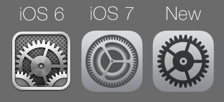
If the Safari icon is the most disliked of the iOS 7 set, Settings is a close second. This icon is a disaster (I actually think it is worse than Safari). Let’s start with the original, iOS 6 icon. It’s a wonderfully detailed set of gears that look like they are made of machined metal. I never quite knew why I should associate gears with Settings (I think switches would have been a better metaphor). But, the icon was beautiful. In iOS 7, Apple seems to have decided the gears metaphor is worth keeping. Unfortunately, this icon only kind-of-sort-of looks like a set of gears. I think they were going for a set of small, fine gears like you might find in a wristwatch. However, you don’t get that until you see the gears animate for the first time when updating the phone’s software. The static icon could just as easily be mistaken for a gas burner on a kitchen stove or space station Deep Space Nine viewed from above. It’s confusing and not particularly good looking.
Shockingly, there’s an even bigger problem with this icon: the glyph. Specifically, the glyph is not actually the gears. Rather, it is the negative space around the gears. The gears themselves are actually just the grey gradient background with the negative space around it removed (in a darker grey). That would not necessarily be a bad thing except that there is no other icon in iOS 7 that is made this way. Apple made a HUGE deal about how much more “consistent” the new iOS 7 icons are than the old set they are replacing. I respectfully submit this as the first of many pieces of evidence that this claim is a load of crap.
For my replacement icon, I try to bridge the gap between the iOS 6 and iOS 7 icons. The convoluted, multi-gear icon is gone and replaced with a single gear that resembles the large one in the iOS 6 icon. The gear glyph is a much darker grey to increase the contrast with the background. There is no negative space nonsense either. I think this icon fits much better with Apple’s themes of “simplicity” and “clarity” in iOS 7 than their own icon does.
Photos
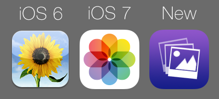
Ok, what is up with the iOS 7 Photos icon? What is supposed to be? A weird, modern-yet-abstract flower? An artist’s color wheel? How on earth does this make me think that my photo albums reside beneath? The old iOS 6 icon never won any prizes either. But, at least a sunflower is something that you might take a picture of. I seriously don’t know what the iOS 7 version is supposed to be, even after all these months. And, like the Safari icon, it has a ton of white space that makes the icon feel unfinished. This is another fixer-upper in my mind.
For my icon, I wanted to use a glyph that might actually remind you of an app that contains your pictures. I think the final result accomplishes this. I originally planned to use just one Polaroid, but could not make it look right. So, I used three Polaroid glyphs, each a bit more transparent to create the idea of a stack of pictures. The icon is still colorful, but also more accessible. And, the useless white space is gone.
Camera
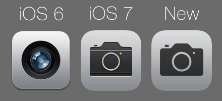
Everyone seems to hate the new camera icon. The photorealistic lens from the iOS 6 icon has been replaced with a glyph that looks an old-timey camera. While I agree the icon has its problems (more on that in a moment), I don’t know what all the people hollering for a redesign of the icons were expecting. Since flat design is now “in,” it has become really hard to convey something like a camera lens in an icon. A simple glyph is about the only option designers have left now that shadows and textures are not allowed. I don’t have a huge problem with this icon. At least it doesn’t bash me over the head with ultra-bright neon colors.
There are still a few problems here. Even though we are now in the era of flat, the camera glyph has a slight inner bevel effect (look at the bottom of the glyph), making it look like it has been stamped into the grey background. The glyph is also slightly different than the glyph used to represent the camera everywhere else in the system (lock screen, Control Center). It has two unnecessary horizontal lines and an odd yellow dot that (I assume) is supposed to represent the flash. Finally, the grey background is a different shade of grey than what was used for the Settings icon, the only other grey icon in the original set. So much for consistency!
Since I didn’t hate the original camera icon, I didn’t change too much. I used the other camera glyph (the one that is used everywhere else in iOS 7) for consistency. I also removed the inner bevel effect. Finally, the grey background is the same as is used for the Settings icon. While it’s still not as nice as the lens of the old icon set, it at least takes care of the most glaring issues in the iOS 7 version.
Reminders
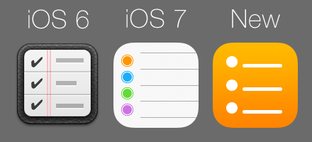
This is another icon that is awash in plain, white space. It’s also one of the ugliest of the new set in my opinion. I think the main issue for me is the grey lines near the very top and very bottom of the icon. I understand Apple was trying to convey that the list of reminders goes on beyond just the few items shown in the icon (i.e. there are more items above and below). But, those lines aren’t necessary and just look like they don’t belong there.
For this icon, I used the orange of the first reminder on the original icon as the background color. The glyph then keeps the same circles and lines look of the original, but in a simple white. The size of the glyph has also been reduced to better fit with Apple’s iOS 7 icon grid. I would submit this as one of the most improved in my revised set.
Game Center
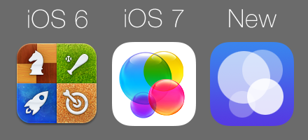
This is another really bad one in the iOS 7 set. The iOS 6, we had an icon divided up into four quarters, each representing a type of game one might play on the iPhone. I always thought this icon was fine since it at least tried to capture the “game” side of Game Center. In iOS 7, the icon is now four glossy bubbles on a plain white background. Ummm…what? What do bubbles have to do with games? And why are they glossy? I thought glossy UI elements were one of the evil things Steve Jobs forced on the world as part of his brain washing to get them to actually buy Apple products. I get that the bubbles are supposed to remind you of the bubbles that float around inside the actual Game Center app in iOS 7. But, seriously, this icon is a disaster. It is horridly inconsistent with the rest of the iOS 7 icons, the white background is again stark and lazy, and you would never know what the icon was supposed to represent unless you read the text label or opened the app at least once.
I didn’t quite know what to do for my redesign. It’s really hard to design an icon to evoke a collection of games. You can’t just pick one glyph, the chess piece for example, without it being mistaken for an actual chess app. And, without the borders in the iOS 6 icon, having a collection of glyphs just makes the icon look jumbled. I ended up just going with a simpler version of the bubbles icon, using transparencies to give a layered effect. I have to admit I didn’t put too much effort into this one. I barely ever use Game Center, and it gets hidden in a folder the moment I set up my phone.
Voice Memos
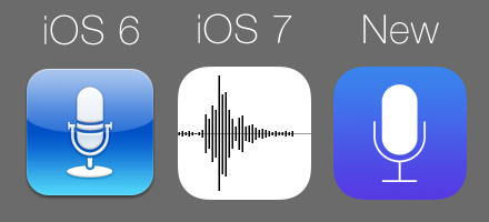
Voice Memos is another icon rendered another plain white background. The microphone on the old icon has been removed in favor of a waveform. As someone with a science background, I get why one might associate a waveform with voice memos. But, I’m not sure the average user is going to make that connection. I also feel this icon looks a little bit too much like the icon for the Stocks app.
For my redesign, I felt this icon really needed some color. I went with a dark blue to add some variety to the set. I also went back to the microphone glyph, as I felt it better represents this app’s purpose.
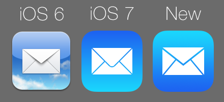
The Mail icon has gone from a photorealistic envelope floating above the clouds to a flat envelope on a simple gradient background. This sounds ok until you notice that the gradient goes from dark to light. When I first saw this icon sitting next to the Safari icon (where the gradient goes from light to dark) I seriously thought it was a mistake. Apparently, it wasn’t and it looks terrible. I have nothing against a reverse gradient, but not when almost all of the other icons have a light to dark gradient. This icon looks totally out of place in the rest of the set.
For the revised icon, I kept the simple envelope. I thought about using a large @ instead, but was afraid it might be confused with the address book. The gradient has been flipped to run light to dark so the icon actually blends in with its neighbors.
Clock
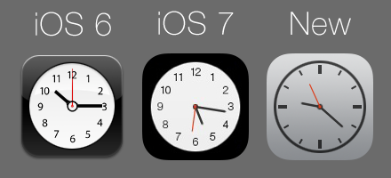
First off, a bit of history about the clock icon. Back in 2004, Apple introduced widgets with OSX version 10.4. These were small little programs collected on a dashboard that could provide you with at-a-glance information. One of the widgets included by default was a clock widget that was a white, analog clock face on a glossy black background. When Apple introduced the original iPhone, it too had a clock app (albeit one that was more functional) and used the exact same icon as the widget from OSX. But, at no point in time has the clock app on the iPhone been an analog clock face on a black background. Because of this, I have always felt the clock icon was out of place and I was really hoping Apple might finally correct this in iOS 7.
Unfortunately, they didn’t. While the gloss effect is gone and the clock hands now actually tell the current time, the icon is still a white clock face on a black background. The app icon still doesn’t quite look like what is inside. Furthermore, I really feel numbered face is a bit too retro for the modern look of the rest of the OS.
For the redesigned icon, I was limited by a few constraints. The app icon still had to be an analog clock of some kind because the moving clock hands are hardcoded into the OS. Also, the color of the hands cannot be changed at the moment, so I was pretty much stuck with a light background. I decided to go with the same grey background as was used with the Settings and Camera icons. For the clock face, I decided to change it to something more modern. The numbers are gone, replaced with simple hash marks. Finally the black border has been reduced to a thin circle. The icon is still functional. But, now it fits better with the overall look of iOS 7.
Notes
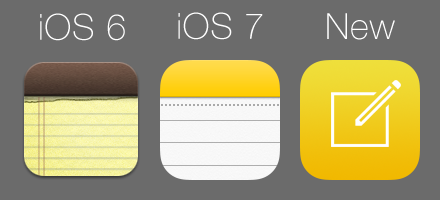
In iOS 7, Apple set out on a crusade to rid the system of all the skeuomorphic elements that had made people fall in love with their software in the first place. Gone was the yellow paper in the notes app and the icon that looked like a legal pad (ripped edge and all). In its place we have…a white legal pad with a neon top? And instead of the ripped paper edge, we have a perforation? This is just an uglier version of the old icon and is no less skeuomorphic.
I wanted to get away from the legal pad look altogether with my icon. It has been done to death and does not fit with the modern look of iOS 7. In its place, I keep the yellow background (though it’s a bit less orange). For the glyph, I used the compose icon found in almost every app on the iPhone. It looks modern and the symbol is instantly recognizable as having to do with creating new content.
Calculator
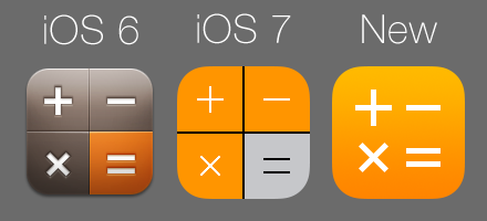
The calculator icon is not the worst of the iOS 7 set. But, that’s not saying much and this icon definitely has some issues. The biggest problem is all the solid orange. It looks easy, like someone just hit the paint bucket tool and moved on. It also makes the icon stick out from the rest of the set, since it is the only one with a colored background that doesn’t have a gradient. It also is a bit odd since the orange buttons in the app actually do have a slight gradient to them.
There are just a few changes in my icon. The orange background now has a gradient and the unnecessary dividing lines have been removed. The symbols have been made bolder to make them easier to see on the light background and pushed closer together so they actually line up with the iOS 7 icon grid.
Music
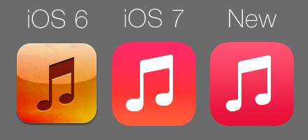
The iOS 6 Music icon was never one of my favorites. I loved the background as it was a direct homage to the iPod commercials from the mid 2000s (the ones with the dancing back silhouette people) that put Apple on the map in the music business. But, the music note glyph always struck me as being off-center. It actually is centered, but about the bottom of the note rather than the stems. However, the glyph is so right-heavy that the whole thing just looks unbalanced.
The iOS 7 version of the Music icon is actually not bad. They fixed the centering issue, and the pink in the background seems to capture the lightness and fun of a music player. My main issue is that the gradient goes from pink to orange for some reason. For my icon there are just a few minor touch ups. I tweaked the shape of the music notes a bit and the background is purely pink (running from a light shade to a dark shade). I didn’t feel any other changes were really necessary.
Videos
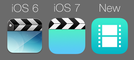
The old music icon featured clapboard bars on a glossy, abstract blue background. In iOS 7, the icon remained largely unchanged. I never really felt this icon fit with iOS 7, and it certainly doesn’t fit with my redesign. I kept the same teal background but decided to go with a glyph representing some movie film instead. I’m not sure this is an improvement. But, I rarely ever use this app so I didn’t put too much effort into the redesign.
Messages
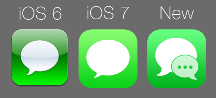
The old iOS 6 icon was one of my favorites. It looked like a chat bubble suspended in a bead of glass. Yes the diagonal lines were not necessary. But they gave the icon a sense of being well-crafted despite being simple. In iOS 7, al the gloss and lines are gone. Instead we have just the chat bubble on a green background. Unfortunately, Apple went with a green that is WAY too neon. In addition to burning my eyes a bit, the bright green also creates poor contrast with the white glyph.
For my icon, I wanted to change it up a bit. I felt the chat bubble in iOS 7 was always a bit too “top-heavy.” That is, the size of the bubble seemed too big for the stem in the lower left. I decided to go with a glyph closer to the messages icon found in later versions of OSX. I felt the two bubbles captured nicely how text messages have become more a mode of conversation rather than just a way to send single messages. As for the background, Apple is actually addressing the green issue with a more subdued hue in the upcoming 7.1 update. I decided to use their revised gradient as it is much less garish.
Phone and Facetime
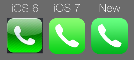
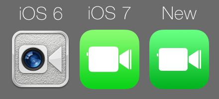
Both the Phone and Facetime icons have been remade in the same green style as the Messages icon in iOS 7. Since Apple is clearly pushing all three as good modes of communication on the iPhone, it makes sense that they should have similar icons. Since I didn’t see a particular problem with either glyph, I toned down the green background and moved on.
Compass
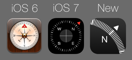
The compass app always struck me as something Apple threw in at the last second to demo the compass included with the iPhone 3GS back in 2009. I can’t figure out why it has been kept, as I can’t imagine anyone actually using this app over the much more fully-featured Maps app. I did feel that the old-timey compass look in iOS 6 was a bit much, and it was not one of Apple’s best efforts. In iOS 7, the App has been given a makeover in with a sleek, modern black look. It does look better, and so does the icon. There are a few small problems. First the plain black background looks about as unfinished as the plain white backgrounds found on many other iOS 7 icons. The second, larger, problem is that iOS already has an icon that looks like a compass! I find it confusing to have two icons that look so similar yet represent apps that have such vastly different functions.
For my redesign, the plain black background has been replaced with a very subtle gradient. You don’t really notice it unless you are looking for it. But, it gives the icon a much more finished feel. For the glyph, I decided to focus in on just the north part of the compass face. It still makes it clear what is inside the app without making the icon too similar to Safari’s.
Newsstand
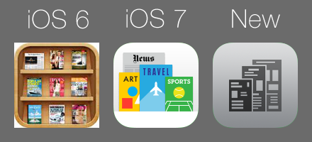
In iOS 6, the Newsstand icon was a set of wood shelves that featured a live preview of any news apps you had inside. While some people really hated the wood texture, the icon was at least helpful in that it provided live information about what was inside. In iOS 7, this has been replaced by a static drawing of some magazines and newspapers on, you guessed it, a plain white background. Now Newsstand is both ugly and useless.
Since the OS can now only call a static icon for Newsstand in iOS 7, I was somewhat limited in what I could do here. I decided to use a simple newspaper glyph on a grey background. As with the Game Center icon, I didn’t put too much effort in here. You can easily disable Newstand on a jailbroken iPhone. So, I never have to look at this icon. At least in my version the stark white background is gone.
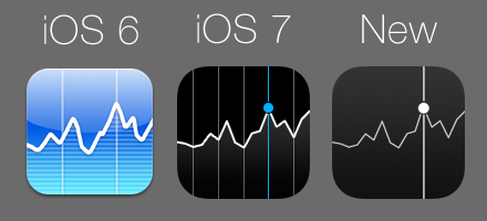
Stocks
There isn’t anything particularly wrong with the iOS 7 stocks icon. Like the Compass icon, the pure black background feels unfinished. However, this was easily corrected by using the same subtle gradient. The glyph was re-rendered in all white. Finally, I removed the grey marker lines, as they didn’t add anything to the icon. I am not thrilled with this one but couldn’t really think of anything better.
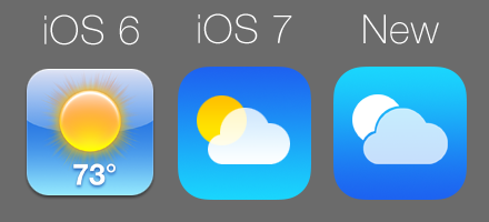
Weather
At first glance, the Weather icon seems fine. The gloss is gone, as is the static temperature readout (if only it was always 73 degrees outside). The sun and clouds in the iOS 7 icon are very geometric, but fit well. Unfortunately, this is another icon with a dark-to-light background. For my icon, I reversed the background gradient and re-rendered the glyph in all white, using a slight transparency for the cloud.
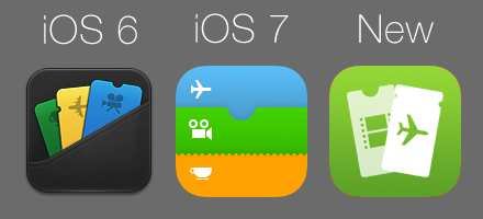
Passbook
The Passbook icon in iOS 7 just doesn’t work for me. It still has a pseudo-3D effect, with each card casting a shadow on the one behind it. At the same time, the fact that the icon was supposed to be a list of cards is not really clear at all unless you have opened and used the app at least once. I decided to be more direct with my icon. There are now only two cards, each at an angle. The left card is slightly transparent so as to appear behind the right one. For the color, I went with the subdued green of the middle card in the iOS 7 icon.
Maps
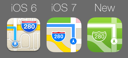
The Maps icon is one of the few that I actually feel was improved in iOS 7. The old icon tried to cram way too many 3D elements and small roads into that small space. There also was way too much beige for my tastes. In iOS 7, there is more color and the number of roads has been reduced, leaving the icon feeling less cluttered. Unfortunately, this icon doesn’t quite fit with my new design guidelines. However, I liked the look, and was able to recreate it using transparencies.
Contacts
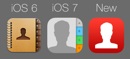
I rarely ever use the dedicated contacts app, preferring to access my address book through the Phone app instead. But, I always felt the bound leather book look of the iOS 6 Contacts icon conveyed the app’s function well. In iOS 7, the spiral binding on the left is gone. But, the tabs on the right that made the icon look like a physical address book are still there, shadows and all. I thought we were done with skeuomorphism? For my redesign, I simplified things even further. The tabs are gone, leaving only the silhouette. I also added a red background to give the icon some color. It’s nothing special. But, then again, I hardly ever use this app.
Calendar
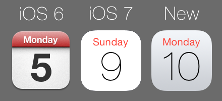
Apple tried to de-clutter the Calendar icon in is 7. Gone is the 3D red bar and bold lettering. In its place is razor thin text on a plain white background. I think the move to such a thin font is questionable at best. It is certainly harder to read at a glance. Unfortunately, like the moving hands on the clock icon, the appearance of the date text on the calendar icon is hardcoded into the operating system. So, it stays for now. As for the background, the stark white again makes the icon look unfinished. I added a subtle light grey gradient for the background. It just makes the empty space feel more like a deliberate decision rather than an accidental omission.
iTunes
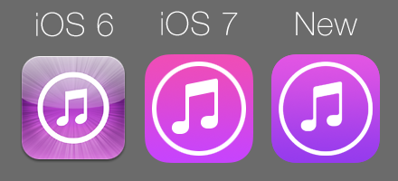
The iOS 7 version of the iTunes icon is basically just a flatter version of the iOS 6 without the starburst effect. I’m largely fine with it. The glyph is simple and clear and the background gradient runs from light to dark. My only gripe is that the light portion of the gradient is a bit on the pink side. For my icon, I just tweaked that color closer to purple.
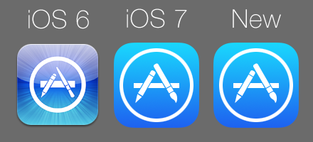
App Store
If you are looking for differences between my icon and the stock iOS 7 version, you won’t find any. This is the only icon I was completely ok with. The gradient is fine and so is the glyph. No change needed!
Conclusion
This might seem like a lot of effort just to touch up a few icons. However, the icons are kind of like the iPhone’s first impression. They are the first thing you see when you unlock your phone every day, and set a tone for the overall experience. If Apple were any other company, I never would have been bothered by the lousy icons in the default set. But the company has a history of excellence in graphics design and failed miserably to live up to it in iOS 7. I may have to live with some of the lousy design choices Apple made in their new operating system, but the icons do not have to be one of them.
I decided to write this blog post a little over a week ago after a large security hole was found in iOS. Many people who had been holding onto iOS 6 for dear life were forced to upgrade to iOS 7 to keep their personal data safe, and a new wave of dismay over the new look spread across my Facebook feed. Since I was nearly finished with my icon set, I decided to jot down my thoughts on how they were designed. Not all the icons are perfect. But, I feel that the set is much more coherent overall while still staying true to the bright colors and modern look of iOS 7. Here’s the final set once again for comparison:
Thoughts? Feel free to share them below.
EDIT: This post was updated on 3/6 to reflect a slightly tweaked Messages icon design.

I think your icons are much better. I really want to use the icons you made. If you can share me your icon files, it will be my honor to use them. Please send those icon files to jameslee02189@gmail.com if it doesn’t disturbs you. Thanks.
Which program did you use? And if possible, where can i download your app pack?
Jailbreak? ah
Hello dear author
very good work
Congratulations
I want to have these icons
Can you help please?
Thanks
Thanks for your interest. I am not working on this theme anymore. But I will throw together the existing icons in a file in the next few days when I have a moment.